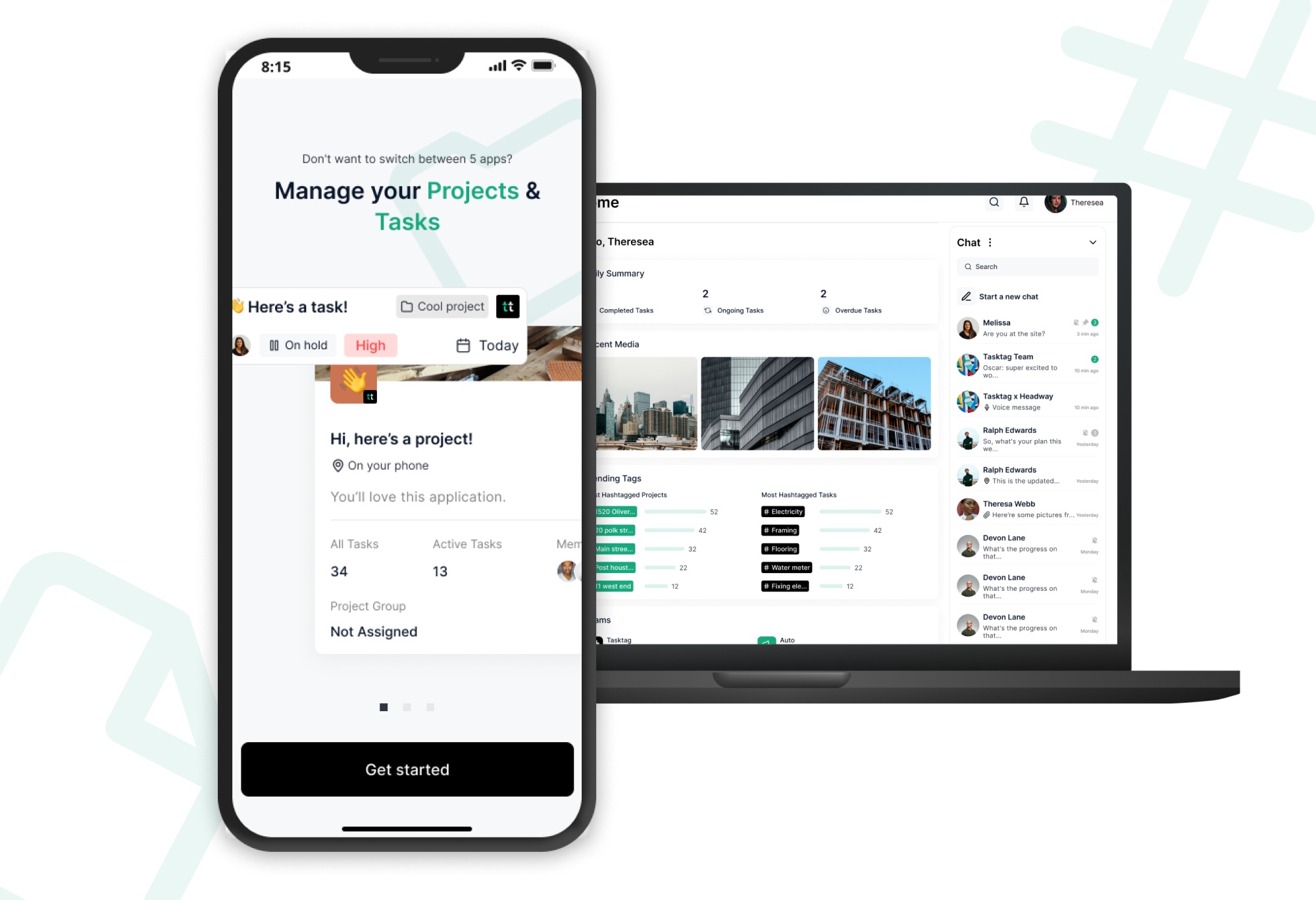
TaskTag
Project management through chat.
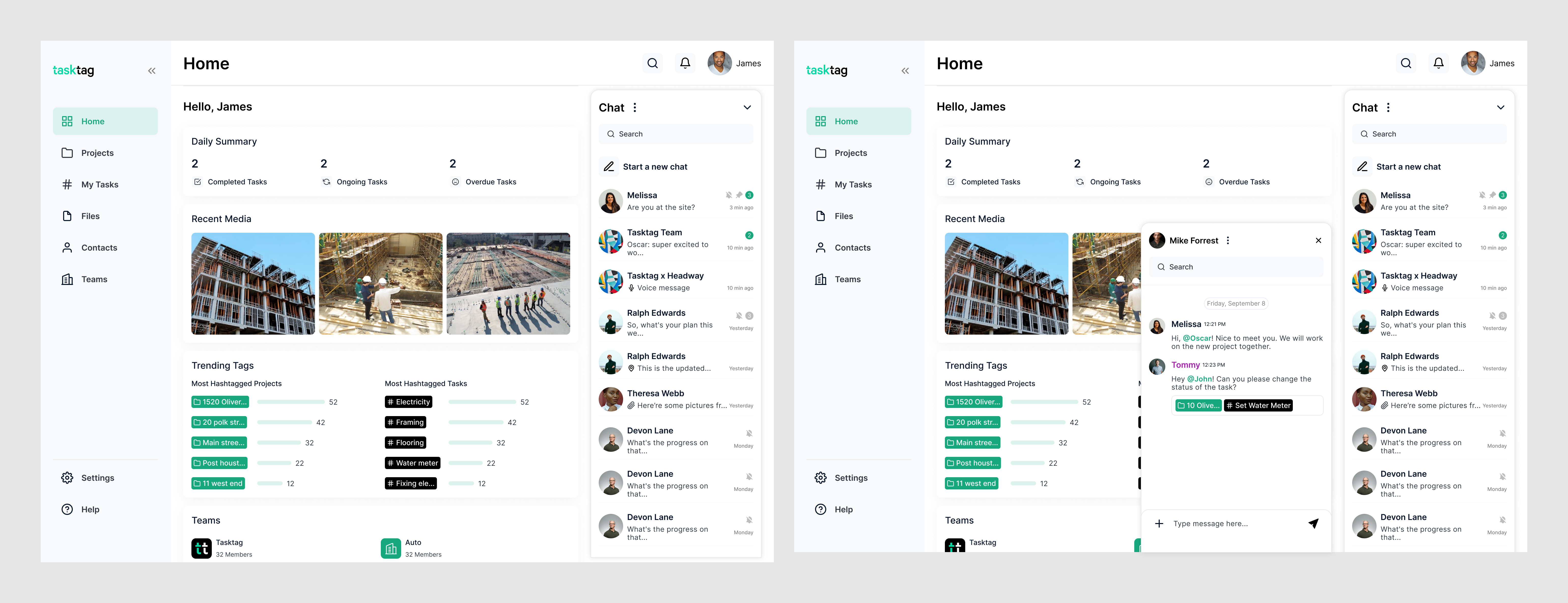
TaskTag converts tasks and projects into hashtags that can be utilized as TAGs in chat. Through this system, files, media, and communication can be filed into a project/task folder and easily tracked.
︎View Website
︎︎︎Download App Store(iOS)
︎︎︎Download Google Play
Overview
Duration
May 2021 - Nov 2022
Role
Product Designer
Core Team
2 designers, 1 PM, 1 stakeholder, outsource dev team(6), branding/marketing(2)
Scope
Mobile App, Web App, Design System, Usability Testing, IA, Prototyping, User Flow, Redesign, Branding, etc
May 2021 - Nov 2022
Role
Product Designer
Core Team
2 designers, 1 PM, 1 stakeholder, outsource dev team(6), branding/marketing(2)
Scope
Mobile App, Web App, Design System, Usability Testing, IA, Prototyping, User Flow, Redesign, Branding, etc
In this project, I led the design from ...
Phase I:
Concept validation and MVP June.2021 - Oct.2021
Phase II:
User Testing and product audit Nov. 2021 - Dec.2021.
Phase III:
Iterations towards perfection and visioning Jan.2022 - Nov.2022
Key Results:
Phase I:
Concept validation and MVP June.2021 - Oct.2021
Phase II:
User Testing and product audit Nov. 2021 - Dec.2021.
Phase III:
Iterations towards perfection and visioning Jan.2022 - Nov.2022
Key Results:
- Beta User Testing results: 95% satisfication rates, increasing 20% than before.
- 5-star-rating on AppStore.
- Worked with cross-functional team to hit critical deadlines successfully.
- Reached 500+ signups on the 2022 International BuilderShow.
Research
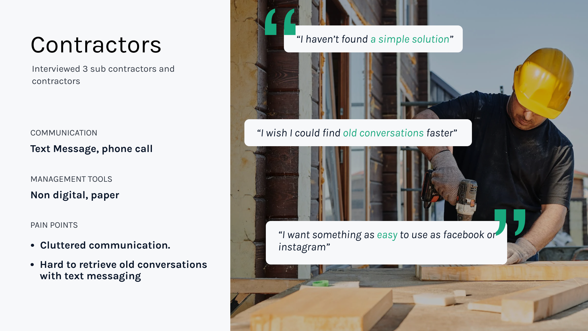
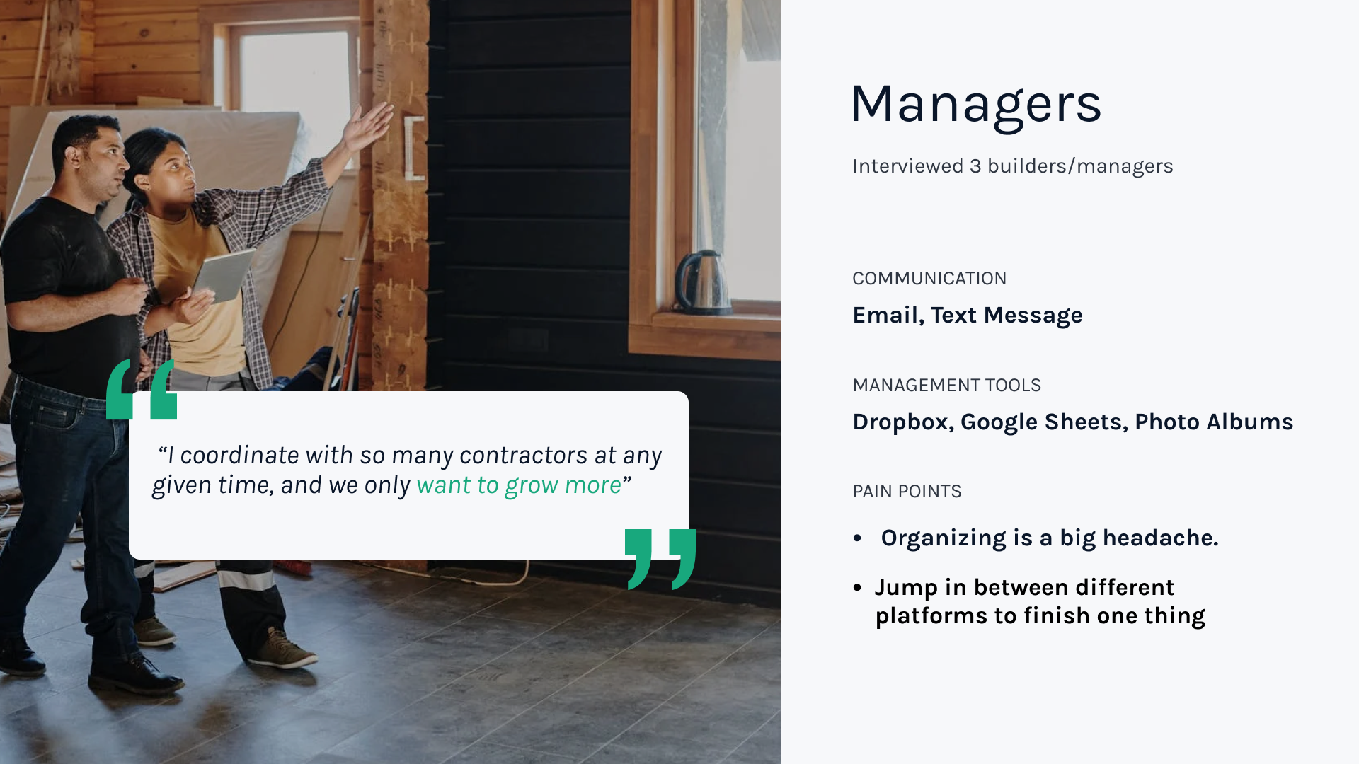
I did 5 in-depth interviews with target users to analyze painpoints and their workflows.︎︎︎How do people in construction industry work?
- Text messaging a lot for work
-
Wear multiple hats
-
Always on the go
-
No much time to manage and organize
PERSONAS
PAIN POINTS
︎︎︎What’e their struggle?
︎Clutter communication between managers and tons of contractors.
︎Text messaging makes it hard to keep track of updates, retrieve files and decisions.
︎Organizing information acorss multiple platforms is time consuming.
︎What happens a lot in their work is scrolling through tons of message history to find a picture or message.
︎Text messaging makes it hard to keep track of updates, retrieve files and decisions.
︎Organizing information acorss multiple platforms is time consuming.
︎What happens a lot in their work is scrolling through tons of message history to find a picture or message.
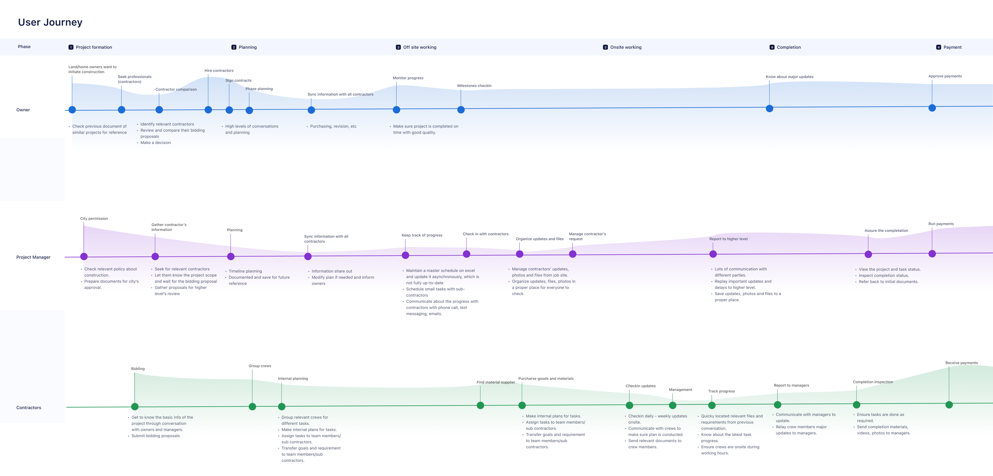
JOURNEY MAP
IDEATION:
︎ Project management through chat/social app features
︎ Unify the communication method between different parties
︎ Empower users to have a platform to access / organize / track images and major updates through chat.
Design
MVP and USER TESTING
- MVP was created in a quick design cycle for validation.
- I designed and led user testing sessions(Usability, Satisfication) for MVP version.
Key insights
1. The discoverability of some main functionalities needs to be improved.2. Some flows such as registration, uploading files can be simplified.
3. Visual hierarchy can be improved
4. The navigation system has too many levels.
5. Project/task creation form looks too formal.
6. Hashtaging in chat function is not intuitive enough. Users can not tell the difference of projects and tasks
“I can not understand the styles of chat messages very well.
Project and task detail page looks overwhelming, so much information and heavily used purple color.
I hope the creation form can be less serious and boring.”

Design Improvements
- Analyzed testing results and tranfered into actionable design tasks.
- Redesigned for optimizing UX and UI, and creating new features upon MVP.
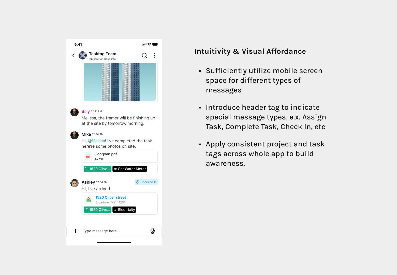
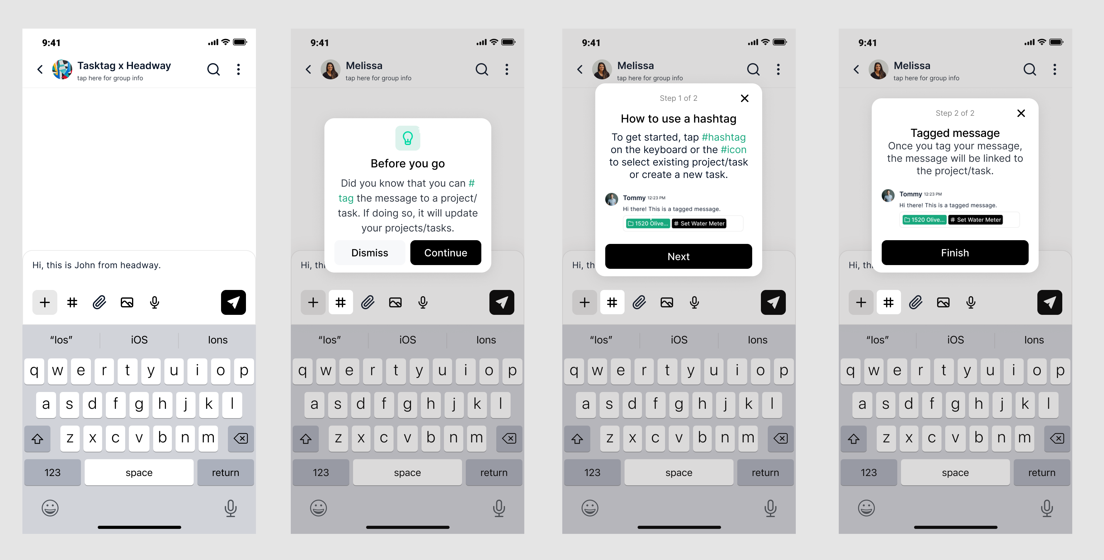
Challenge 1: Tagging experience in chat
Before
Intuitivity & Visual Affordance Issue
- Tag Design: Project initials don’t work well in helping users know the relationship of the project and task. Non of the 5 participants can tell.
- Some messages such as assign task, and checkin don’t have enough distinction from regular messages.
Design Experiments
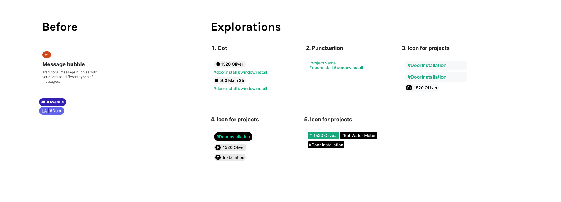
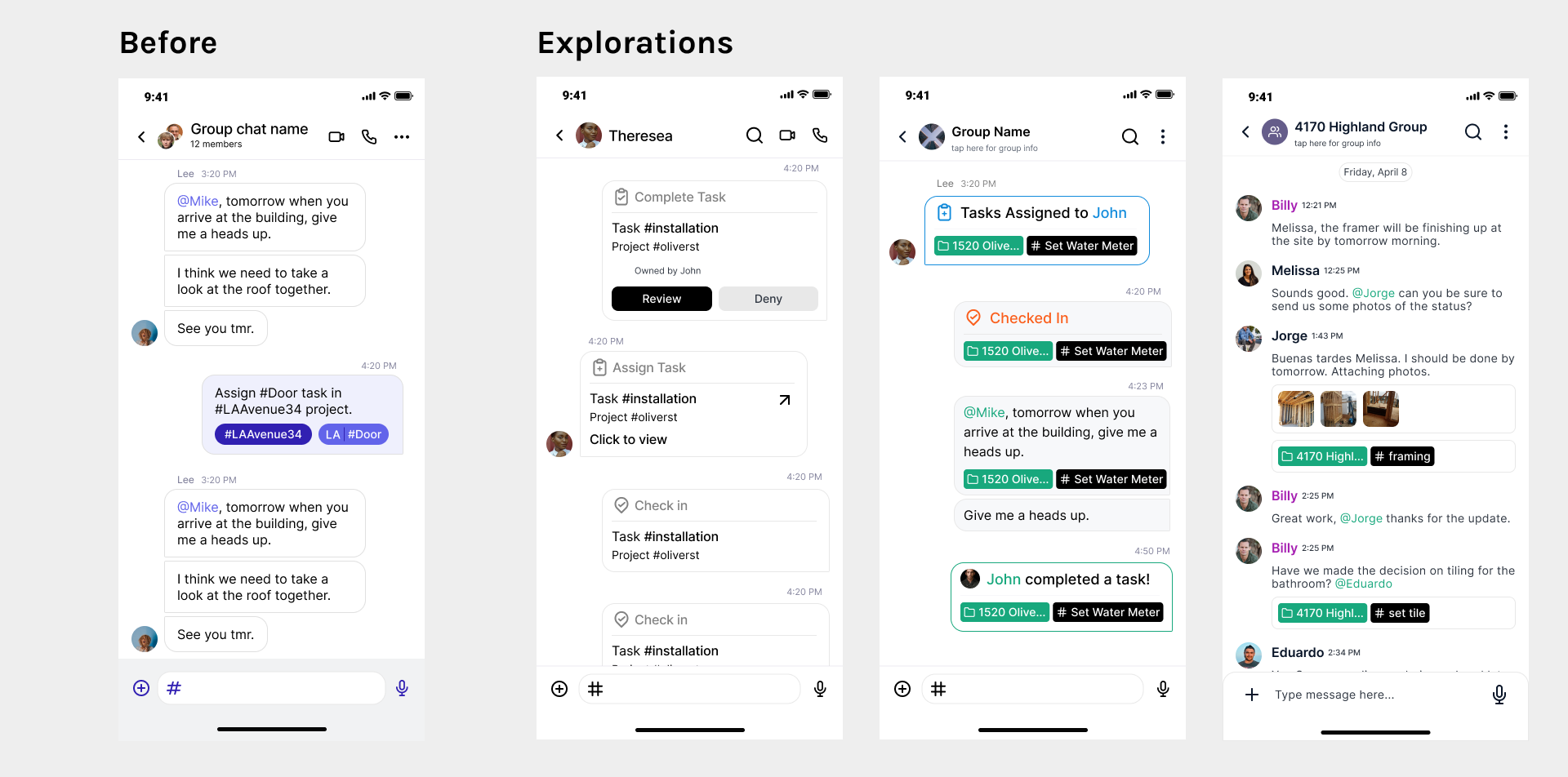
Redesign:
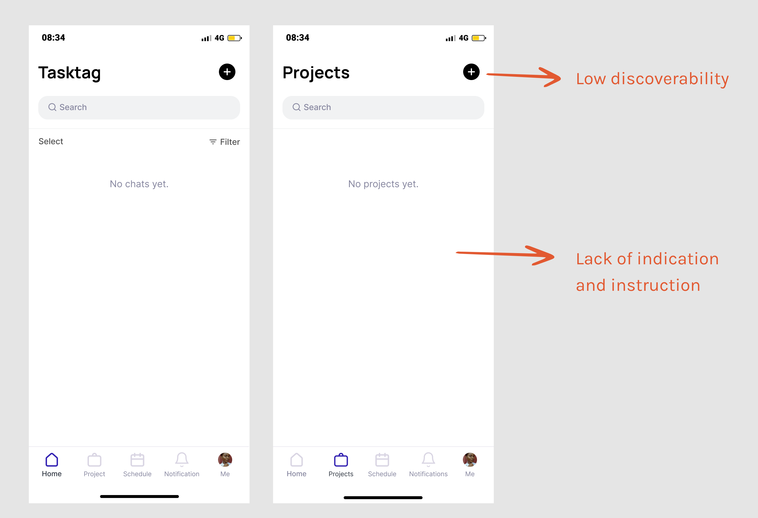
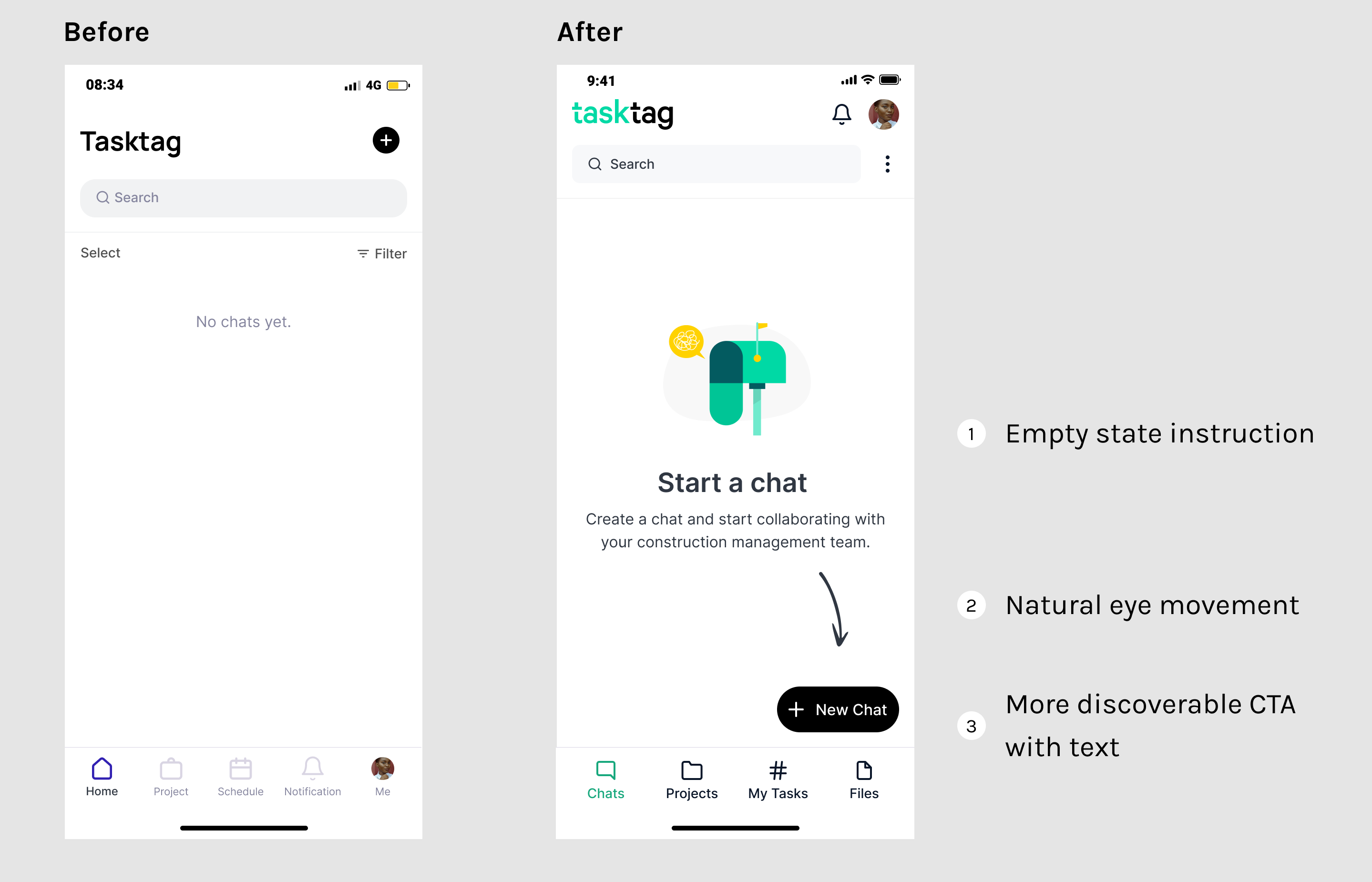
Challenge 2: Improve the first time user experience
Problem of V1 design:
First-time users feel ambiguous when land on the empty screens.
It takes excessive take to find out what’s the screen for and where’s the CTA.![Before]()
First-time users feel ambiguous when land on the empty screens.
It takes excessive take to find out what’s the screen for and where’s the CTA.
Redesign:
Empty State:
Onboarding tutorial:
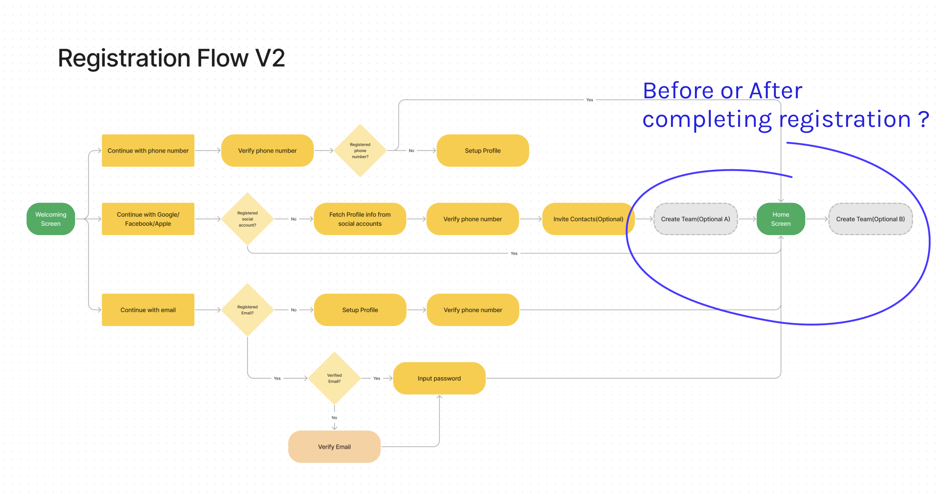
Challenge 3: Enterprise flow
I did A/B testing for incorporating enterprise flow.5 out of 5 participants reflected both flows are straightforward, natural and acceptable. With the extra business value to bring people on teams, I decided to put the team creation within registration process.
![Two options for adding team creation flow]()
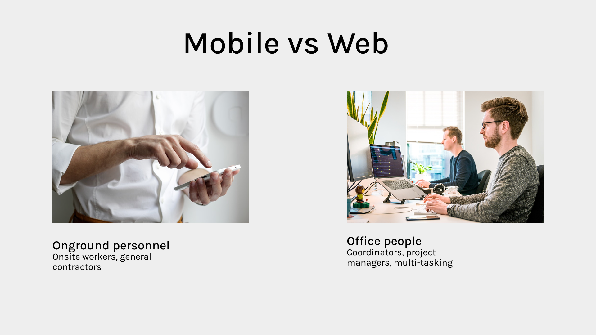
Challenge 4: Web version
Bring values to different groups of users.
Other key areas for improvements:
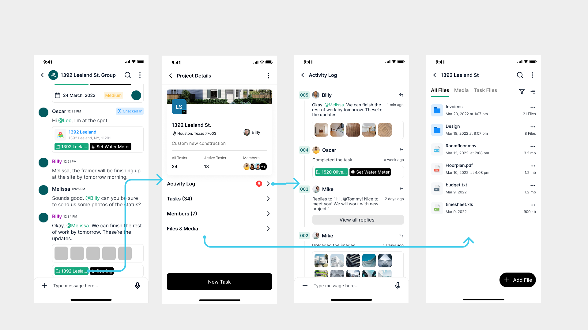
- Restructured the information architecture to decrease the navigation levels to 3 max by adding bottom menu to 2nd level pages
- Redesign the menu navigation to leverage business goals and users’ feedback.
- Visual Patterns: Apply the similar pattern across the whole app to keep consistent.
- Improved the onboarding experience by reducing average completion time by approx 15%.
- Rebrand to enhance the product identity.
- Users satisfication rate was significantly improved to 95%.