Kang Shen(PO), Sagar Peri(PM), Headway developers and Marketing consultants
Platform
IOS, Android, Web
TaskTag converts tasks and projects into hashtags that can be utilized as TAGs in chat. Through this system, files, media, and communication can be filed into a project/task folder and easily tracked.
Project management through #hashtag while chatting
Phase I: Turning complex information architecture into design ideas
Phase II: Built an MVP and ran user testings
Phase III: Iterated and go to market faster
Outcomes
95% Satisfication rates
5 Star Rating on AppStore
Worked with cross-functional team to hit critical deadlines successfully.
Reached 500+ signups on the 2022 International BuilderShow.
/Context/
Problem Space
1. Clutter communication between managers and tons of contractors. 2. Text messaging makes it hard to keep track of updates, retrieve files and decisions. 3. Organizing information across multiple platforms is time consuming. 4. What happens a lot in their work is scrolling through tons of message history to find a picture or message.
User Journey
Design Goals
(UXUI) Easy learning curve for low-tech users (UX) Adaptive to different types of users (UXUI) Modern and friendly design for users to buy-in (Function) Enable users organize and store everything right without using additional softwares (google drive, dropbox, timeline mgmt sheets)
/MVP/
Executed sitemap, user flows, low-fi to high-fi mockups for implementation. MVP testable version was completed within 3 months.
User Testing
To gather indepth understanding of real users’ behaviors and inform future design. I initiated and conducted 5 in-depth user testing sessions with target audient group.
Key Findings
1. The discoverability of some main functionalities needs to be improved. 2. Some flows such as registration, uploading files can be simplified. 3. Visual hierarchy can be improved 4. The navigation system has too many levels. 5. Project/task creation form looks too formal. 6. Hashtaging in chat function is not intuitive enough. Users can not tell the difference of projects and tasks
/Design Iterations/
Onboarding
Before
Iterations
1. Information Overload: Registration form looks daunting. Users are not familiar with User ID. 2. Users think ‘skill fields’ is asking too much.
Onboarding
After
Iterations
Discoverability: Prioritize Sign Up option Make the CTA consistent Information Overload: Work with PM and PO to eliminate fields Welcoming/Onboarding Screen: Add a more engaging welcoming screen and provide the info about the App.
Outcomes - onboarding
Completion time
The average completion time was reduced by approx 15%.
Users’ satisfication
Users' satisfication rates improved to 95%/100%
Ease of registration
Non of the 5 participants raised questions or confusion about the modified registration steps.
Chat Message
Before
1. Project initials don’t work well in helping users know the relationship of the project and task. Non of the 5 participants can tell. 2. Some messages such as assign task, and checkin don’t have enough distinction from regular messages.
Chat Message
After
1. Sufficiently utilize mobile screen space for different types of messages by getting rid of chat bubbles. 2. Introduce header tag to indicate special message types, e.x. Assign Task, Complete Task, Check In, etc 3. Apply consistent project and task tags across whole app to build awareness.
Empty State
Before
Empty State
After
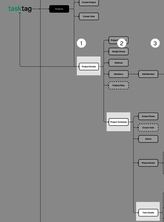
Information Architecture
Before
4 - 5-level navigation happens in the app. Needs too many ‘back’s to return homepage or jump in between different pages.
Information Architecture
After
Restructured the IA to decrease the navigation levels to 3 max by adding bottom menu to 2nd level pages.
Information Architecture
Before
My files section is not discoverable. The hierarchy for profile and my files makes users confused.
Information Architecture
After
Redesign the menu navigation based on stakeholder’s interview, feature prioritization, business goal and users’ feedback.